I'm all done with MOOCs until the middle of October. That means it's time to get some more baseball card posts nailed to the Now and Zen wall. So without further ado, let's look at some of my favorite cards from the fantastic Mr. Downs.
Two more Upper Deck Masterpieces- A 2008 Carlos Zambrano and a 2008 Kosuke Fukudome rookie. Nice!
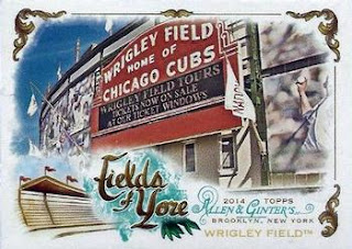
2014 Allen & Ginter's Fields of Yore, Wrigley Field
I don't know why, but I like Topps Attax cards. I suppose if I had duplicates, (a lot of 'em) I'd give the game an actual go of it. Here's the Wrigley Field game card (2011), which is my favorite Attax design.
An odd thing about Topps Attax- The card shape, borders, and backs vary depending on the year they are printed. Good gravy, there are decades worth of CCG/TCGs out there that have consistently used the same card stock, size, shape, border and back designs no matter what year boosters were released. {Well there was that whole Pokeman complete re-do a few years ago, but I never got into Pokemon, so I can't say much about it.} But, dang Topps... you really mangled a potential money maker. Unlike us frugal trading card collectors, gamers are willing to pay bucks to have the more powerful cards. Tsk. Tsk.
Action Packed- two more puffy lovelies! Fergie Jenkins and Billy Williams.
Score 1990 and 1991 are not my favorite designs. Each set has multiple border colors in the base set, giving each team multiple colored borders. I don't hate them, but some of the border colors look much better than others. The blue border on the Sandberg card is nice, but what's the point of the oddball yellow letters (an 'R' on this example) of the player's given names? Anyway, the Sandberg is from the 1991 set. I am using it as an example of the base set's design. Next to it is a 1st Round Draft Pick card of Lance Dickson. Now I dig the Dickson card! Had the entire 1991 set been of this design, it would be one of my favorites.


In the case of 1990 Score, unless McDonald's is giving away free baseball cards, or these colors were chosen for the Astros alone, there is no excuse for this color scheme. Again the border colors were all mixed up for any given team. And, the (G and M) highlighter design for this Greg Maddux card lacks good taste. Just sayin'. However, interspersed throughout this unappealing base set are cards like this Mitch Williams. Again, if the base set looked like this Williams design, it would rank high on my favorites list.
Topps has printed some stinkers as well. The design for the 1993 base set is blah, and the design on the back of these cards is even worse! Ick. I chose this Rick Wilkins card to use as example of the 1993 Topps base set design because the photo is superb. Check out that face mask! How many Gs does a catcher have to pull to leave his face mask with the chore of catching up to him? Dang!
Now here are the two 1993 Topps Cubs cards with a pretty design Yes, I said pretty. Those stars are pretty, and I like the atmospheric glow of the baseball. Could you imagine the entire base set having an astronomy theme? Talk about COOL!
Last, but never least, are four new to me Ernie Banks cards. Turn that frown upside down.
I've decided to create a specific updatable blog entry to add my Ernie Banks cards to as they come in. I'll still create new posts when they show up, but I think it would be nice to have one Now and Zen page dedicated to my Ernie Banks cards as the primary Now and Zen go-to page in The Ernie Banks Project.
Have a great day everyone!


